Thursday, 25 June 2015
Wednesday, 10 June 2015
Analysis of 3 corporate videos
1) Chanel make up - Smokey eyes:
This video is promoting Chanel's make up and they do this by giving us a step by step tutorial on how to do smokey eyes professionally, using Chanel products. The style is very simple and definitely focuses on the products itself instead of making a complicated video that has way too many things going on in the background.
2) 34 frames per second:
This video is promoting the army territory and they do this by showing us a very boring day to day life in London and then showing the excitement of being in the army. They show people that are already in the army and they tell us what it's about joining them. The style is quite simple but not basic, When I say this I mean that the footage has a lot going on but the editing itself is very simple to do.
3) Storm:
This video is showing the celebration of Worcester Artillery Day that marks the day of the 100th anniversary of the first ever world war. The show us how the are setting up for the parade by showing us where it will be taking place, the army practicing their routines and more. The style of this video is very basic and the editing is also very basic. The footage is very clear and the voice overs make it very easy to understand.


Justification of final concept and rejection of the other two
I
decided to pick the Westminster mile corporate video due to the fact that it
has a bigger cause than my other initial ideas. The Westminster mile corporate
video is able to have a bigger target audience not only because it is for
charity but because it is a fun run for literally everybody to join; from kids
to the able elderly. The run is all for a charity named Bupa which is a charity
that helps people with heart problems. This run creates awareness for a lot of
people and also uses a run to help with others hearts, which I find very
clever.
The
reason I did not choose the MAC corporate video is down to the fact that it is
only for women and that does not create a purpose because it is simply
advertising foundation and would not receive the same amount of public viewers
as the Bupa Westminster mile would have. I also did not choose this particular idea
because it is promoting make up and most people in our society have now come to
a stage where they want to be told that natural beauty is better, so advertising
skin creams would probably be better than foundation.
I
also did not choose the IPhone6 corporate video idea because although it has a
wide audience, it is also very expensive and does not help towards a good cause
apart from having a nice phone which is not more important than the Westminster
mile. The IPhone6 is very easy to promote but extremely hard to sell and for
this reason, I have chosen to go with the Bupa Westminster mile corporate video
idea.
Opening sequence evaluation
In my opinion, my opening sequence was not successful and this
is mainly because the footage was not my own. The footage itself was good but
it was hard for me to be able to edit it whilst trying to make it fit my soap
theme. After showing my soap opening sequence to a few students, they agreed
that it would have been better to get my own footage because it was hard to
tell a story with different footage. In all honesty, it was a very rushed piece
and I understand that I could have done much better within the space of time
that I had been given. In my opinion, in order for me to have made a successful
opening sequence, I would have had to give myself more time and planned what I was
going to do. What was successful about this opening sequence was that although
it wasn’t any of my own footage, I was able to edit it well enough for it to
fit my soap theme and each clip worked well with each other. I was able to get
everything from the college meaning I did not need to try and make it look like
City of Westminster College because it was already footage of the college
itself. If I had the chance to do it all over again I definitely would and that
is because I know that I did not work to my full potential. The opening
sequence had nothing to do with what I had originally planned but in the end it
worked out okay. I did not enjoy making this sequence because it was very hurried and not well thought out and without using my own footage, it did not have the same effect on me as my previous work had.
Tuesday, 9 June 2015
THE APPEAL OF THE HUNGER GAMES: MOCKINGJAY PART 1
The Mockingjay part 1 was all about the lead up to the finale. Considering I had watched the first Hunger Games, I did not particularly enjoy this movie.
Although this trilogy has been extremely popular, a lot of people agreed that this particular movie was the least interesting of them all. In my opinion, it feels like Lionsgate is dragging this out, making it more of a saga than an actual trilogy and it is boring the viewers but although most people did not enjoy this movie as much, they did feel almost dedicated meaning they still wanted to watch part 2 when it came out.
My favourite part of the movie is the calming song Katniss sang; The hanging tree:
This scene of the movie begins with Katniss singing the song 'Hanging Tree' whilst sitting with others. As she continues to sing the song, the movie cuts to other scenes as the action builds up gradually. The song continues in the background and although the action scene is going on, it is still very calming and gives a powerful or even a striking feeling towards it.
In conclusion, I did not enjoy this movie because I'm not a fan of this trilogy and had to skip a whole movie meaning I wasn't able to understand everything that was going on and it took a while to get a grasp of everything that had gone on in the previous movie. The movie itself wasn't terrible but I found it almost boring considering the actual 'hunger games' were not happening in this movie which is what I expected (Because I am not a fan and did not know what to expect). I enjoyed certain parts of the movie but did not understand much of the beginning because it did not make any sense to me.
Friday, 5 June 2015
Audience Theory
PASSIVE AUDIENCES:
- They are seen as couch potatoes just consuming media texts, particularly commercial television programmes.
- The audience believe and accept all all the media text that they receive.
- This is known for not requiring the active use of the brain.
ACTIVE AUDIENCES:
- They are seen as individuals who are active and interact with the communication process and use media text for their own purpose.
- The are different people from different backgrounds with many different attitudes, values, experiences and idea.
www.kecasmedia.blogspot.co.uk/2012/10/making-sense-of-audience-theories.html
EXPERIMENTS:
PASSIVE AUDIENCES:
The hypodermic syringe model:
The idea is that the media injects messages into the audience, who 'receives' them like a drug.
The Bobo doll experiment:
This experiment was performed in 1961. The children were put in a room with a life size doll and were made to watch a video of someone being violent towards the doll; kicking and punching it. In the experiment, the children then imitated the video and began to be violent towards the doll in the room.
ACTIVE AUDIENCES:
Uses and gratifications:
This type of audience behavior was first discovered in the 1950's. It sees the audience actively seeking media texts which fulfill a particular need or function for them.
The uses and gratification theory states that audiences use media texts to fulfill the needs they have or provide them with a sense of pleasure. Blumer and Katz (1979) theorised that these uses and gratifications feel into four broad categories; Diversion, Personal Relationships, Personal Identity, and Surveillance.
-chrisupsona2.wordpress.com/2012/11/OG/passive-audience-theory/
-mediaknowall.com/as_alevel/alevkeyconcepts/alevelkeycon.php?page10=audience
SUMMARY:
The PASSIVE audience is a negative view for the media, demonstrating frightening or damaging effects.
The ACTIVE audience is a positive view for the media, where they feel the need to study into media texts for pleasure.
Thursday, 4 June 2015
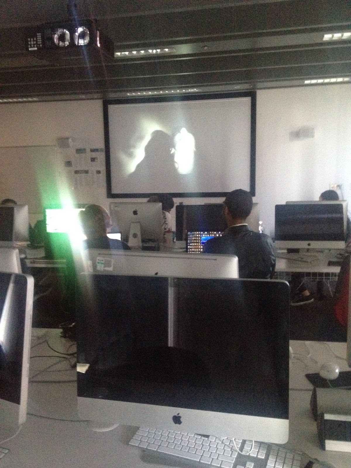
Tate Modern Video Intallations


This video installation is called Oil and sugar and was created in 2007 by Kadar Attia. In this video installation, black oil is poured over a tower of white sugar and I believe this represents the black and white of our society. The fact that the video installation is continuously repeated made me think it was a representation of our society destroying our world by polluting it and continuously polluting it without thinking about it. The room has two separate entrances and a bench in between the two and then has the video projecting on the the wall ahead.


This installation is called Tiny deaths and was made by Bill Viola in 1993 and is shown by using three large screens on three different walls in a pitch black room. As you walk into the room, it is completely pitch black to a point where it is ridiculously hard to even see shapes of people around you and they use muffled voices and eery noises to almost give you the feeling of actually experiencing what is going on in the video installation. After standing in complete darkness for a while, an image on a man appears on the screen in black and white and only stays there for a second and then over exposes and disappears in a flash and this continues with other humans throughout.
The video itself is very simple but because it is so ambiguous it give many people different impressions and I felt that it was almost made to show life flashing before our eyes. The darkness enforced that theme as it felt like you were completely alone in your thoughts watching life flash before my eyes.

This video installation is called Nixon and was made by Nam June Paik in 2002. The installation is made by using two very old fashioned televisions on top of a cabinet with magnetic coils wrapped around each screen. The televisions play a clip of Nixon's television appearance in 1965. The coils causes the footage to jump, causing disruption.
Documentation


My feedback was very positive for my video installation and everybody got exactly what I was going for. One student mentions that using the definition in the beginning to let the audience understand what my installation was about was a good idea because although my installation wasn't completely confusing, it would have been much harder for people to understand. A lot of the students said the music worked really well with the theme I was going for and it made the video much more effective. I had some constructive criticism from my teacher and that was to add more to it or even get even more weird with what I was going for to add to the 'dream' theme. All in all I was very pleased with the feedback and the reactions of the class and think it was quite successful.
Is DVD dead?
What is a DVD? DVD’s, also known as digital video disc, is a
type of compact disc that has been made to store large amounts of data. DVD’s
are well known for storing movies which is definitely large amounts of data.
Most DVD’s include certain key features beginning with a list of options such
as play movie, scene selection, bonus
features etc. and this is called a submenu. By using a submenu, it makes it
easier for the viewer to choose exactly what they were looking for and makes
everything a lot more organised and easier to find. In 1995, the DVD was
invented and developed by Phillips, Sony, Toshiba and Panasonic and was
ludicrously popular up until now, 2015… But is the DVD dead?
To be able to understand if the DVD is dead, there was a
discussion in a class of seventeen to nineteen year olds, it was clear that
most people thought that the DVD is dead but there were still a few points made
as to why the DVD is not dead.
To begin with, there are many different streaming platforms
such as Netflix, Amazon prime etc. that is now very popular for the simple
reason it costs as little as £5.99 a month and you’re able to view hundreds of
movies, cartoons and even series and most people tend to think paying one price
a month for so many different options is much more worth it than paying that
one price for just one movie that is probably going to be watched once and
ended up being a dust collector on a shelf. Most DVD’s tend to cost roughly £15
if they’re just released and decrease in cost as the movie gets older. As
teenagers, we’re not likely to buy DVD’s as social media inflicts and
constantly advertises media platforms we can use in order to save our money and
not have to wait for movies to come out on DVD, whereas the older generation
tend to enjoy collecting DVD’s or some people much older do not completely know
how to use the internet for things such as finding movies online, so they find
it easier using DVD players and continuing to do what they’re used to.
Another point made as to why the DVD is dead, is the fact
that Mac laptops and computers are very popular in this day and age but are now
being made without DVD drives and that was a common way of viewing DVD’s. DVD
players were very common when invented and it upheld until 2012 when streaming
became more and more recognised. Now although I have spoken about streaming
using media platforms such as Netflix and Amazon primetime, it is very
well-known that there are many free streaming sites to watch the latest movies which
cause people to not only not buy DVD’s but to also not go to the cinema because
why would anyone spend money watching a movie they can see from the comfort of
their homes for free?
Now although most people would say the DVD is dead, there are
quite a few people that think otherwise. A lot more of the older generation
still tend to purchase DVD’s for different reasons such as having children,
collecting them or simply understanding DVD’s more that media platforms. When
it comes to people with children at a certain age, it is a popular entertain
them with movies or even children programmes and most children find it easier
to use DVD’s as well as the older generations therefore they are still brought
by many people.
Still on the point of DVD’s not being dead, they have a
resale value. Although using DVD’s may not be as popular as it used to be,
people are able to sell them. This is a point that could object to why some
people don’t use media platforms. By using things such as Netflix and Amazon
prime, you pay a price for what you’re receiving but you can never try and sell
anything for it whereas DVD’s are still able to be sold after many years of
having it in your possession which is why a lot of people still tend to use
DVD’s instead of the internet to find movies for free.
In my opinion, I don’t believe the DVD is completely dead but
I do think that it is slowly dying. As a teenager myself, it is more popular
for us to use media platforms instead of movies and I tend to use Netflix for
everything and hardly even watch my own television because I watch many
different series on Netflix where I can watch episode after episode whereas
watching a series on the television, you have to wait a week at a time. I
haven’t purchased a DVD lately or know anyone that has but I do still watch the
DVD’s I have when it comes to things such as movie marathons with friends.
Wednesday, 3 June 2015

Script for video pitch
The magazine I would like to pitch for is Vogue or Essence. This magazine covers a range of stories from fashion to culture and the tone of the magazine is creative and informal. My idea for a series of images is to incorporate both culture and fashion into my photos, showing the beauty of culture. I will take the photos by using lights, reflectors and photoshop if needed. I think that my images would appeal to the magazines target audience because there is a different theme each month and still incorporates fashion, which is what the audience looks for.
Wednesday, 20 May 2015
Friday, 1 May 2015
Evaluation on my final photographs
My final piece was meant to portray both fashion and culture
within the images and was also meant to be for either Vogue or Essence. My idea
for the images was to incorporate both culture and fashion and that is because I
After presenting my final piece to the class, I was able to gain constructive
feedback from them. My wanted to show the beauty of culture that others do not
see. I took these photos by using a back drop, lights (No natural lights), a
reflector and Photoshop when it was needed.
After explaining this to my class mates, some of them believed that it would
work more for Essence than Vogue because it mainly involves culture which
Essence prides themselves upon. They also thought that although it is clear
that culture is one of the main focuses in the images, they thought that using
fashion and culture together would be too complicated and only focus on one
culture because I used an African them as well as an Egyptian theme.

This
image got the best feedback. Most of the class preferred this image because
they believed the lighting wasn't too overpowering and it made the model the
main focus as it was the intention. Although they seemed to like this images
most, they thought it could have been better if I hadn't have cropped the image
as much as I had.
When it came to the lighting, both the class and I believed that
most of the images had been overpowered by the background. Even though there wasn't
anything in the background, the fact that it was too bright blew the model out
and almost made you focus on just how bright it was instead of the model. The
class mentioned the fact that the lighting on the model was good and shouldn't be
altered with because it exposes her golden skin tone just the right amount
without the exposure and brightness being touched in Photoshop. They also
thought that the eyes made the photos much stronger and added to the cultural
theme that I was going for. Although there was a confusion between what was African
and Egyptian, my class mates agreed that the images were strong and the colours
that were used, enhanced the models skin tones and helped to add to the
cultural theme. Whilst they thought my piece was strong, they believed that
instead of using a studio, I could have used a background in places such as a
forest, an urban area, etc. and that would have built to the cultural theme or
made it a bit more Vogue related and even more professional than it currently
is.
So from the feedback I had been given, I now know how I can
improve my final piece. I do believe that I should have concentrated on one
theme instead of trying to incorporate two complete different themes that is
very hard to portray on their own in the first place. On that note, I could
have just focused on culture because my images showed more of the cultural side
than the fashion focused theme. Whilst I should have focused on culture, I used
more than one (African and Egyptian) which ended up confusing my audience, so
next time I should centre my images to just one culture to prevent confusion.
Considering I chose to pitch my images to Vogue and Essence,
I have decided that it would be best to pitch my images to a more urban
magazine which is more about the culture I was trying to go for which would be
Essence. I do not think my photos would be appropriate for Vogue simply because
how formal and professional they are and they are normally looking for
something different and diverse, something that isn’t particularly shown in
other magazines, whereas my images were much more appropriate for Essence magazine
because they focus on black beauty and like to show people (such as young black
girls) that there is beauty in every colour, culture, shape and size and I
believe my photos fit that description as much as it can without coming too far
from the fashion side of things. Now although I’d only pitch my images to
Essence magazine at this point, I’m not certain the picture editor would use my
images for the simple reason that it doesn’t completely fit the description that
is needed for the magazine itself and the edits I have made to the photos
themselves (Such as cropping too much off the pictures) because it takes away
from the photos and professionalism of the whole piece itself.
If I had another chance to do this, I would continue to go
for culture and also stay in a studio but this time I would use a few props to
enhance the culture I am going for instead of just using the clothing to portray
the cultures I was trying to represent. When editing I won’t use as much
exposure for the contrast and brightness as it did not work well with the
model, although I wouldn’t change the lighting on the model herself because I felt
that it worked well with her skin tone and the colours she was wearing at the
time.
Although I would definitely use the same colours, I would
try to find a different body wrap that matches the same colour as the previous
body wrap, but this time it will enhance the African theme instead of
portraying an Egyptian theme. Apart from that, I will be keeping everything else
that was worn in the images because I felt that it all worked well with each
other.
Thursday, 23 April 2015
Treatment explaining the content of my video piece
My video installation will begin with a time lapse of clouds in the daylight then suddenly slow down to look more like an illusion. The video will then merge with a one person staring into the camera (Medium close up) smiling whilst holding either a lolly pop or candy floss. The people will begin to change but will stay in the same position all doing the same thing (Staring into the camera smiling with candy floss or a lolly pop). Video will then use the same faces but they will not be smiling anymore but will still be holding the props. A time lapse of dark clouds will then fade in and again, suddenly slow down. A clown will then stare into the camera just like the other people. Then it will flash through the different people's faces. One person's face with have them looking at their hands in shock then they run their hands down their face with the fake blood. Another person will have the fake blood coming out of their mouth. The last person will have blood coming from their nose and eye (with made up bruised eye). The clouds come back in (Daylight representing dreams not nightmares). The shots go back to the people with blood over them and they all begin to smile individually as they wipe away the blood.


Friday, 27 March 2015
Wednesday, 18 March 2015
Task 1- Installation Nasties!
A Little Death- Sam Taylor Wood
After watching Sam Taylor Wood's video called A Little Death, where we watch a hare decaying and a peach sitting by it staying healthy, we discussed what we felt about it as a class and it was surprisingly very controversial. Although the video itself was very simple, it was also extremely ambiguous because everybody had different perspectives on what Sam Taylor Wood was trying to portray.
In my opinion after watching the video I felt a slight sense of nausea from watching the hare decay, but after thinking about the video itself and not what was going on, my interpretation on it was that Sam Taylor Wood was trying to portray life and death in the continuous video clip. I don't believe she was actually trying to show a hare decaying, in fact she was trying to show a living thing dying. This made me think further into what she was trying to make people think and I came to a few more conclusions such as the hare represented a poor and deprived human that dies because it doesn't have the nutrients or medicine needed to keep it alive and the peach represented a richer human that has everything needed to keep them alive, and this whole thing represented how looks at the society of today, meaning we look at charities and most people don't give to the needy because they just simply don't care whereas people look at celebrities (The rich) and practically bow down to them for doing irrelevant things such as getting implants, going to jail or even taking drugs. Taking drugs, going to jail, drinking alcohol, etc. are things we all frown upon when it comes to 'poorer' people, for example a lot of people say "I'm not going to give homeless people money because all they'll do is spend it on drugs and alcohol" and continue to leave them on the streets not having a care in the world but another example, Lindsay Lohan took drugs, went to jail and much more but we still let her off, and why's that? Because she's a celebrity with money! Now we come back to the hare and the peach. I strongly believe it represents the way our society thinks and where our priorities lie.
The Clock- Christian Marclay
The Clock is a video installation that is originally twenty-four hours long that is shown in the White Cube. This video installation is extremely simple but is also complete genius and this is because it took the maker of the video, Christian Marclay two whole years to make! The video shows a numerous amount of movie clips that show clocks or somebody checking the time, the genius of the twenty-four hour movie clip is that the time it shows on the video is made to synchronize with the time in real life. This is such a simple idea but takes a serious amount of time and commitment to accomplish it. It almost makes people feel more connected because of the time and once people realise the time in the video installation is the same time as the real world, we begin to feel a hint of anxiety as we continue to watch and understand what is happening. I began to think deeper into the installation and something that stuck out to me was the fact that when watching a movie, it takes us into their world which makes us oblivious to the time but what Christian Marclay did was make us more aware of the time, which I also thought he did to show us what today's society are about. we are constantly checking time, we are time conscious, time obsessed and time has become oppressive to a point that we can't escape it anymore. A saying a lot of people say is "Time is money" and once again, this enhances how time obsessed we have become. I don't believe Christian Marcley made this because he was bored or because he thought it was a cool thing to try out, I think he did it to make people realise just how time conscious we have become after all of these years.
Sterling Silver- (video art installation)
The video installation I found by Sterling Silver was quite similar to the first video installation that I analysed, A little death. The reason I say this is because they are both quite simple but extremely ambiguous throughout. This installation showed a man kneeling on the floor wearing a fox mask with a drum and a woman standing next to the man wearing high end clothes and looked very stylish whilst holding a plain bag that said 'Wishes'. As the music grows louder, the woman begins to pour the bag of 'wishes' above the man whilst he is banging on the drum. Now many people will have very different aspects of the video but in my opinion it's telling us another message about our society. I believe the woman wearing high end clothes represent how our society cares about how we look without thinking about where the clothes, hair or even make up comes from. The woman then poured the red glitter over the man as he banged on the drum and I think the red glitter represents the blood from the animals that die for us to have make up, clothes etc. but to us, we don't think about the death of the animals when we are wearing a fur coat. I then think the bag says wishes on it to show that our society cares about the materialistic things and are basically saying it's okay to kill the animals if that means they can get the items they're 'wishing' for. I then believe the man banging the drum is representing the fact that animals don't have a voice and have no say in what happens to them, their family or they're friends.
Wednesday, 11 March 2015
Supersize me analysis
Supersize me
The documentary I will be analysing and discussing is called Supersize
Me. This particular documentary is performative because the filmmaker is
making himself the vocal point of this documentary. Performative is considered
the most honest kind of documentary, for we see them on their daily life
talking about what they've done and exactly how they're feeling at the time.
Performative documentaries are often mistaken with reflexive documentaries
because the filmmaker sits in front of the camera, but it is not. The
documentary America’s Most Hated Family mad
by Louis Theroux is a reflexive documentary but he does not always get in front
of the camera, he mainly interviews the family and gets their view on things,
whereas in Supersize me Morgan
Spurlock gives his own opinion on things and also talks to the camera as though
it is his diary. Having the filmmaker also being the ‘guinea pig’ can be very
complicating but also, as said before, very honest, as we can see him getting
others point of view but we know its primary sources for he goes to find this
information out himself on the camera.
Supersize
me is a documentary about a man
named Morgan Spurlock doing an experiment a based on the famous worldwide fast
food restaurant; McDonald’s. He
understands that McDonald’s isn’t
good for us and that in America, obesity is a very big issue. He decides to
make a documentary about doing an experiment of himself eating only McDonald’s for thirty days, no
exceptions.The documentary begins with a group of children singing a popular cheesy song “Pizza hut, Pizza hut, Kentucky fried chicken and a Pizza hut...... McDonald’s!!!!...” They cleverly used this clip of the children singing as it undermines the restaurants and shows how the children’s minds have been tainted to believe that McDonald’s and other fast food restaurants are perfectly okay and even fun to be at. They are taught to believe this even before they’re taught simple things in school such as punctuation.
Supersize Me mainly shows real footage. He tends to speak directly to the camera and if he is either speaking to somebody else or showing a clip of something, he normally uses voiceovers which give the audience a sense of comfort and trust. If we hear him speak about what he’s doing then get a load of other people to give facts and opinions, most viewers tend to get bored and not actually believe everything that is being said nevertheless, hearing Morgan speak for himself, being such a normal person that is just like any of us, we can relate and people generally think more about it when seeing somebody that’s not so different to them do an experiment like this. There are also technicalities of realism within the documentary as they things like natural lighting throughout, use of natural sounds such as traffic and other outdoor noise etc.
He also uses footage such as advertisements of McDonald’s when it was first established to its recent days which shows the progression of the restaurant and how much the company have grown. Within the documentary, Morgan visits the doctors to see how his health is coming along since starting this experiment and the doctor give primary information as he informs both Morgan and the viewers that if he continues eating this amount, he could actually die. This again give the documentary a sense of realism. Morgan then goes to visit people that are in fact greatly overweight, obese even, and he asks them how they got to that weight and they then inform Morgan that McDonald’s (as well as other fast food) will make you overweight and eating as much as Morgan was, will not make you overweight, but will make you obese.
Mini Documentray work- OFCOM
Unit 27 task 1
For my documentary will be “Do you think that
Marijuana should be legalized?”
Ofcom:
Section 2: Harm and offence:
To ensure that generally accepted standards are
applied to the content of television and radio services so as to provide
adequate protection for members of the public from the inclusion in such
services of harmful and/ or offensive material.
Ofcoms broadcasting rules state that not only are
they protecting under-eighteens, but also the rules are also to provide
adequate protection for adults. If you use facts, they have to be 100% true and
be backed up. The rules are only here to prevent harmful and offensive material
being shown to the wrong audience.
Section 3: Crime:
To ensure that material likely to encourage or incite
the commission of crime or to lead to disorder is not included in television or
radio services.
Ofcoms broadcasting for crime state that footage that
might encourage crime is not allowed to be shown on television simply because
they don’t want people to try and copy what they see and get arrested. This
means because smoking ‘weed’ is illegal as long as we edit our footage to not
give any influential ideas we can in fact have people smoking in our
documentary.
BBC Guidelines:
Section 5: Harm and offence:
The BBC editorial guidelines state that harm and
offence, covers a lot more than Ofcoms, with there subheading being “Alcohol, Smoking,
Solvent Abuse and Illegal `Drug use”.
The use of illegal drugs, the abuse of drugs,
smoking, solvent abuse and the misuse of alcohol:
Must
not be featured in content made primarily for children unless there is strong
editorial justification
Must
generally be avoided and must not be condoned, encouraged or glamorized in any
programmes broadcast pre-watershed or on radio when children are particularly
likely to be in our audience, or in online content likely to appeal to a
significant proportion of children, unless there is editorial justification
Must
not be condoned, encouraged or glamorized in other content likely to be widely
seen, heard or used by children and young people, unless there is editorial
justification.
- After reading the rules and regulations, I
understand that although the subject of the documentary is about Marijuana,
it’s not illegal to talk about it; it’s just illegal to smoke it on camera. The
footage in which I put in the documentary must not be encouraging and must be generally
condoning.
Wednesday, 4 March 2015


Wednesday, 25 February 2015
Interesting framing techniques


Monday, 23 February 2015
Defenition of rule of thirds
The Rule of Thirds is when you divide a picture into three equal segments. You then use the grid to position the object of interest in one of the thirds which will automatically catch your eye, allowing for the image to flow better.

This is a photo I have taken, but here are some more examples:

.jpg)

This is a photo I have taken, but here are some more examples:
Large depth of field
Settings:
Aperture- F22
Shutter Speed- 1/500
ISO- 400
Large depth of field is when a photo is taken without having a focus point, the photo is continuous until we can't see anymore. It is normally used when taking scenic photos.


Shallow depth of field
Settings:
Aperture- F5.5
ISO- 400
Setting- AV
Shallow depth of field is when a photo has a main focus point and everything else in the background is blurred out. Most people tend to use this when taking nature photos or when they're taking photos of people in a busy surrounding.


Wednesday, 11 February 2015
Photographs demonstrating the use of shadows
With shadow photography, all settings are kept the same on the camera just like the photographs used when using the reflector. The only difference now is that we have taken the reflector away and taken the photos from the opposite side of the spot light. This is normally used mainly for males, as the shadows focus of the muscles and structure of their face which gives a masculine feature.


Light Graffiti
Settings for light graffiti:
- Manual mode
- TV
- Shutter speed at 30 seconds
- ISO at 200


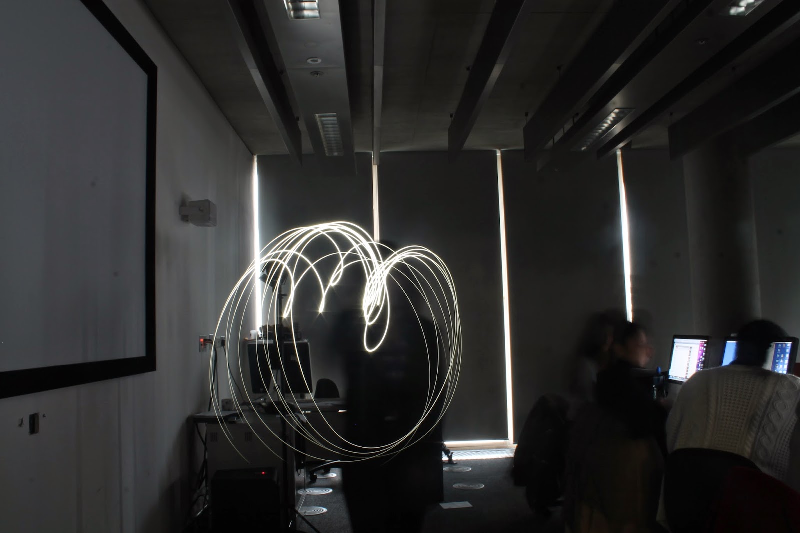

- Manual mode
- TV
- Shutter speed at 30 seconds
- ISO at 200
Subscribe to:
Comments (Atom)